

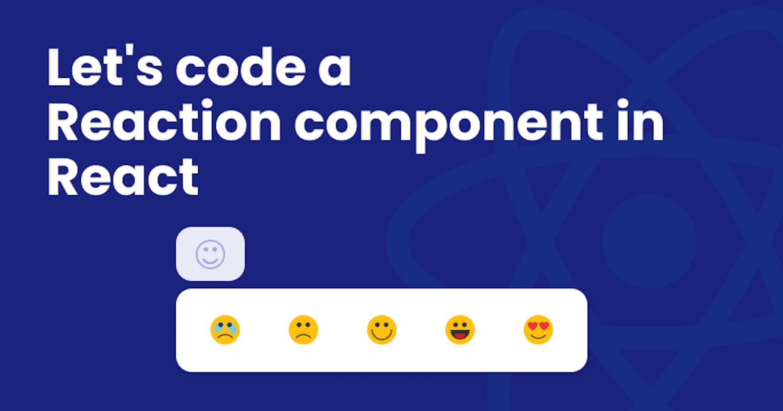


What will we be coding?
We are gonna code a reaction component with following features
- User clicks on the button to trigger the reaction bar and the reaction bar closes on clicking on the button again.
- User can click on one of the reactions to react and this action closes the reactions bar after setting the reaction.
- If already reacted, and user clicks on the button, the reaction is reset
Make sure to install node-sass if you're gonna use sass
Let's begin with JS
ReactionButton.jsx
import React, { useState } from "react";

import { ReactComponent as Crying } from "../../assets/crying.svg";
import { ReactComponent as Sad } from "../../assets/sad.svg";
import { ReactComponent as Happy } from "../../assets/happy.svg";
import { ReactComponent as Happy2 } from "../../assets/happy-2.svg";
import { ReactComponent as Love } from "../../assets/in-love.svg";
import { ReactComponent as NoReaction } from "../../assets/no-reaction.svg";

import "./reaction-button.scss";

const ReactionButton = ({ state, setState }) => {
  const [isTriggered, setIsTriggered] = useState(false);

  const reactions = [<Crying />, <Sad />, <Happy />, <Happy2 />, <Love />];

  return (
    <div className="reaction-button">
      <button
        className={`reaction-button__trigger ${
          isTriggered ? "reaction-button__trigger--active" : ""
        }`}
        type="button"
        onClick={() => {
          if (state === null) {
            setIsTriggered((val) => !val);
          } else {
            setState(null);
          }
        }}
      >
        {state !== null ? reactions[state] : <NoReaction />}
      </button>
      <div
        className={`reaction-button__reactions ${
          isTriggered ? 'reaction-button__reactions--active' : ''
        }`}
      >
        {reactions.map((reaction, index) => (
          <button
            key={index}
            className="reaction-button__reactions__reaction"
            onClick={() => {
              setState(index);
              setIsTriggered(false);
            }}
          >
            {reaction}
          </button>
        ))}
      </div>
    </div>
  );
};

ReactionButton.defaultProps = {
  state: null
};

export default ReactionButton;
Going over the code, I've imported useState (we'll be using hooks to manage the state) followed by asset imports and scss file import(we'll go over that as well in a short while).
const ReactionButton = ({ state, setState }) => {
Notice that the actual reaction state and its corresponding setState function will be passed as props from the parent component as there is no easy way to pass back the state from child to the parent.
const [isTriggered, setIsTriggered] = useState(false);
We're gonna be using isTriggered as a state variable to add and remove a class to our reactions bar from where the user is gonna be clicking on a reaction. The default state is set to false.
const reactions = [<Crying />, <Sad />, <Happy />, <Happy2 />, <Love />];
This line is gonna create an array of React.createElement calls for mounting SVGs that I've imported.
      <button
        className={`reaction-button__trigger ${
          isTriggered ? "reaction-button__trigger--active" : ""
        }`}
        type="button"
        onClick={() => {
          if (state === null) {
            setIsTriggered((val) => !val);
          } else {
            setState(null);
          }
        }}
      >
        {state !== null ? reactions[state] : <NoReaction />}
      </button>
Then starts the markup. The component is enclosed in a div with a className of reaction-button. The immediate child, button, has a class of reaction-button__trigger [ I'm using BEM conventions for naming the classes. Let's talk about it some other day ;) ]. On clicking the button, isTriggered is toggled and depending on the value of isTriggered, reaction-button__trigger--active is added to the classList. If the user has already reacted, the reaction is set to null. The reaction displayed in the button body is also conditionally rendered. If there's no reaction, a default emoji is rendered and one of the reactions is rendered otherwise.
      <div
        className={`reaction-button__reactions ${
          isTriggered ? 'reaction-button__reactions--active' : ''
        }`}
      >
        {reactions.map((reaction, index) => (
          <button
            key={index}
            className="reaction-button__reactions__reaction"
            onClick={() => {
              setState(index);
              setIsTriggered(false);
            }}
          >
            {reaction}
          </button>
        ))}
      </div>
Next comes the reaction bar. This div has a className of reaction-button__reactions and if isTriggered is set to true, reaction-button__reactions--active gets added to its classList. This class is gonna help us show and hide the bar. Within this div, we have the reaction buttons with the className reaction-button__reactions__reaction. We are looping through the reactions array to populate the div. On clicking one of these buttons, we are gonna set the reaction index and close the reaction bar.
Let's style it!
reaction-button.scss
@import '../../sass/base.scss';

.reaction-button{
  position: relative;
  &__trigger{
    padding: 0.5rem 1rem;
    background: none;
    border: none;
    border-radius: 1rem;
    transition: background 300ms ease;

    &--active,&:hover{
      background: #e8eaf6;
    }

    svg{
      width: 24px;
      height: 24px;
    }
  }

  &__reactions{
    display: flex;
    position: absolute;
    top: calc(100% + 0.5rem);
    left: 0;
    padding: 0.5rem;
    border-radius: 1rem;
    box-shadow: 4px 4px 15px rgba(0, 0, 0, 0.1);
    transform: scale(0);
    transform-origin: top left;
    transition: transform 300ms ease;
    background: #fff;

    &--active{
      transform: scale(1);
    }

    &__reaction{
      padding: 0.5rem 1rem;
      background: none;
      border: none;
      border-radius: 1rem;
      transition: background 300ms ease;
      margin: 0.25rem;

      &:hover{
        background: #e8eaf6;
      }

      svg{
        width: 24px;
        height: 24px;
      }
    }
  }
}
*, *::before, *::after{
  margin: 0;
  padding: 0;
  box-sizing: border-box;
}

button:focus{
  outline: none;
}
base.scss contains some rules to remove the default styling applied by the browsers.
.reaction-button{
  position: relative;
}
Coming to the styles that matter, reaction-button class has a position: relative because we'll be setting the position of reaction-button__reaction as absolute with respect to this class.
  &__trigger{
    padding: 0.5rem 1rem;
    background: none;
    border: none;
    border-radius: 1rem;
    transition: background 300ms ease;

    &--active,&:hover{
      background: #e8eaf6;
    }

    svg{
      width: 24px;
      height: 24px;
    }
  }
Next comes the styles for the reaction-button__trigger.There's nothing much to explain here, just some properties to make the button look pretty. When reaction-button__trigger--active is applied or the user hovers over the button, it gets a very light shade of blue applied to it.
  &__reactions{
    display: flex;
    position: absolute;
    top: calc(100% + 0.5rem);
    left: 0;
    padding: 0.5rem;
    border-radius: 1rem;
    box-shadow: 4px 4px 15px rgba(0, 0, 0, 0.1);
    transform: scale(0);
    transform-origin: top left;
    transition: transform 300ms ease;
    background: #fff;

    &--active{
      transform: scale(1);
    }

    &__reaction{
      padding: 0.5rem 1rem;
      background: none;
      border: none;
      border-radius: 1rem;
      transition: background 300ms ease;
      margin: 0.25rem;

      &:hover{
        background: #e8eaf6;
      }

      svg{
        width: 24px;
        height: 24px;
      }
    }
  }
There are couple of things to note here. First,
    position: absolute;
    top: calc(100% + 0.5rem);
    left: 0;
This makes the bar appear right below the button. Second,
    transform: scale(0);
    transform-origin: top left;
    transition: transform 300ms ease;

    &--active{
      transform: scale(1);
    }
transform: scale(0)hides the component by shrinking it and whenreaction-button__trigger--activeis applied, this gets overridden withtransform: scale(1)and this brings the component to its normal size.transform-origin: top leftmakes the component scale from top-left. By default, it would have scaled from the center.transition: transform 300ms easemakes sure the sweet interaction takes its time.
That's it! We did it. That's all it takes to code this amazing component! I hope you enjoyed reading this and I hope this helped you. Thanks for stopping by and reading. Have a great day!
P.S : I'm creating a react component library and this is one of many awesome components that are going to be added.