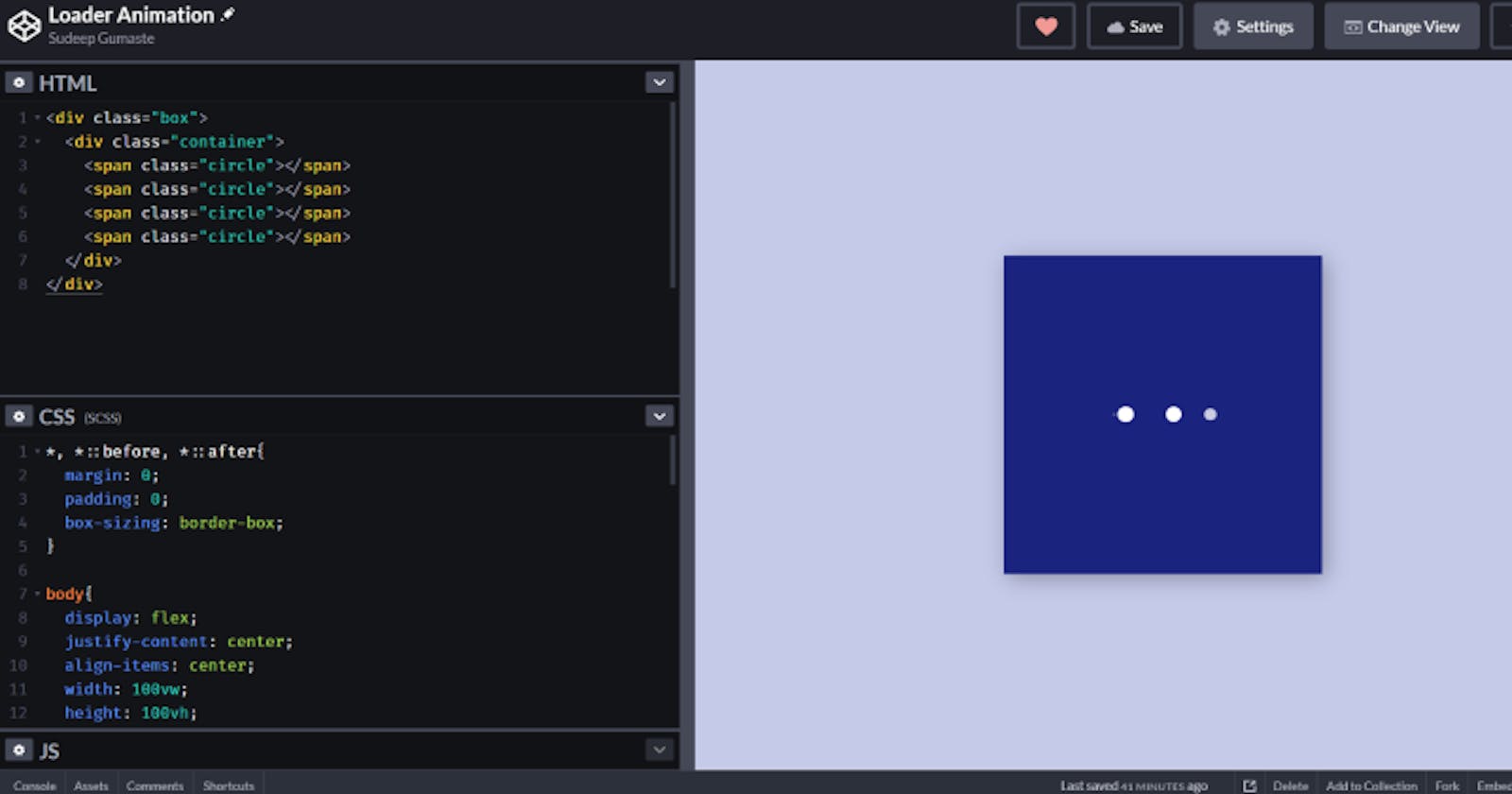
Hey there amazing human! I came across this dope loader animation a while ago and I thought I should code that. Today in this blog post, we're gonna code that together! Sounds interesting? Then lest's jump right into it!
Starter code
This is the initial code that we're gonna be starting with
Starter HTML
 <div class="box">
  <div class="container">
    <span class="circle"></span>
    <span class="circle"></span>
  </div>
</div>
Starter CSS
/* I don't like the default styles applied by the browsers */
*, *::before, *::after{
  margin: 0;
  padding: 0;
  box-sizing: border-box;
}

body{
  display: flex;
  justify-content: center;
  align-items: center;
  width: 100vw;
  height: 100vh;
  background: #c5cae9;
}

.box {
  width: 300px;
  height: 300px;
  background: #1a237e;
  display: flex;
  justify-content: center;
  align-items: center;
  box-shadow: 4px 4px 20px rgba(0, 0, 0, 0.3);
}

.container {
  height: 15px;
  width: 105px;
  display: flex;
}

.container .circle {
  width: 15px;
  height: 15px;
  border-radius: 50%;
  background-color: #fff;
  margin-right: 30px;
}
This should result in something that looks like this:

Yes, there are just two circles for now
Let's get movin
Let us now start by moving these circles to the right. In order to do that we'll need a keyframe animation.
@keyframes move {
  from {
    transform: translateX(0px);
  }
  to {
    transform: translateX(45px);
  }
}
The code is pretty straight forward. We are starting from 0px and moving the circles 45px(15px + 30px margin) to the right. We're using transform to move the circles. You could also use left with couple of extra steps but it's better to use transform performance wise.
Now that we've coded a keyframe animation, let's apply it to the circles.
.container .circle {
  width: 15px;
  height: 15px;
  border-radius: 50%;
  background-color: #fff;
  margin-right: 30px;
  /* added line */
  animation: move 500ms linear 0ms infinite;
}
In animation property, we'll mention the animation name and other attributes. Let's break down this line.
- The keyframe's name is move
- Animation duration is 500 mili seconds
- The timing function is linear
- There's a delay of 0ms
- The number of iterations are infinite
AND we have the two moving circles! The first step is done!
Grow and shrink
Now on to the next step, we need to make the first circle look like it's coming from behind or make it look like it's growing. For that, we need to add a circle to our html, inside the container div
    <!-- added line -->
    <span class="circle"></span>
    <span class="circle"></span>
    <span class="circle"></span>
To achieve the desired effect we need to position it absolutely with respect to the container. So we need to add position: relative to the .container class and then position the first circle.
.container {
  height: 15px;
  width: 105px;
  display: flex;
  /* added line*/
  position: relative;
}
To select the first circle, we're gonna use a pseudo selector
.container .circle:first-child {
  position: absolute;
  top: 0;
  left: 0;
}
We have now successfully positioned the first circle. We now need to write keyframe animation to animate it. Let's call the animation grow.
@keyframes grow {
  from {
    transform: scale(0, 0);
    opacity: 0;
  }
  to {
    transform: scale(1, 1);
    opacity: 1;
  }
}
This time, we're animating two properties, we are increasing opacity and we are scaling the circle. Let's apply this to the first circle
.container .circle:first-child {
  position: absolute;
  top: 0;
  left: 0;
  /* added line */
  animation: grow 500ms linear 0ms infinite;
}
LOOK AT THAT! We're almost there.
We need one more circle. Add that to the html inside .container class
    <span class="circle"></span>
    <span class="circle"></span>
    <span class="circle"></span>
    <!-- added line -->
    <span class="circle"></span>
We gotta make this circle stay at the end of the .container class. Yes! you guessed it! We need to add position: absolute to the last circle. Again we'll be using pseudo selector.
.container .circle:last-child {
  position: absolute;
  top: 0;
  right: 0;
  /* also need to remove the margin */
  margin-right: 0;
}
ON TO THE LAST STEP! We need to shrink it and decrease the opacity. Rather than writing a keyframe for this, we're gonna use the existing grow keyframe but we'll reverse it.
.container .circle:last-child {
  position: absolute;
  top: 0;
  right: 0;
  /* added line */
  animation: grow 500ms linear 0s infinite reverse;
}
To do that, all we need to do is add the direction the animation property. It's set to forwards by default. We are gonna set it to reverse.
VOILA! We did it! We have successfully coded the dope loader. Ain't that illusion of continuity amusing?! Thank you for reading! Thank you for your time and patience. I hope this helped. Happy Coding and have a great day!
